Crypto Swapping App
Market Context & Business Needs
I was contracted to design the MVP of a DEX aggregation company’s mobile app. The company wanted to err on the side of impact over perfection, and for the team to move quickly, in order to remain competitive in the market.
+ Emerging User Needs
With more and more Crypto swapping happening on mobile, users need a way to easily integrate DEX aggregation on their phones to get the best price.
Settings Goals
How I defined the direction to go in:
High-Impact Focus: Optimize for fast, best-priced swaps to drive volume.
User Trust & Transparency: Clearly display trade details to encourage retention.
Mobile-First Experience: Prioritize speed, simplicity, and reliability over complex features.
30%
Migrated & retained web users
Tools used
Play Prototyping (Swift UI)
Who Is The Core User?
User is familiar with Web3 and have a wallet like MetaMask, Coinbase Wallet, etc.
They don’t need hand-holding to set up a wallet but might need a smooth connection process.
Users are actively trading or swapping tokens, meaning they already have assets in their wallet.
Fiat on-ramps aren’t a priority for MVP since the user is not new to crypto.
Since "Our Company" aggregates prices from multiple sources (Uniswap, SushiSwap, 0x, etc.), users expect better trade execution than going directly to a single DEX. We should display this.
Gas fees, slippage, and price impact are key decision factors for that.
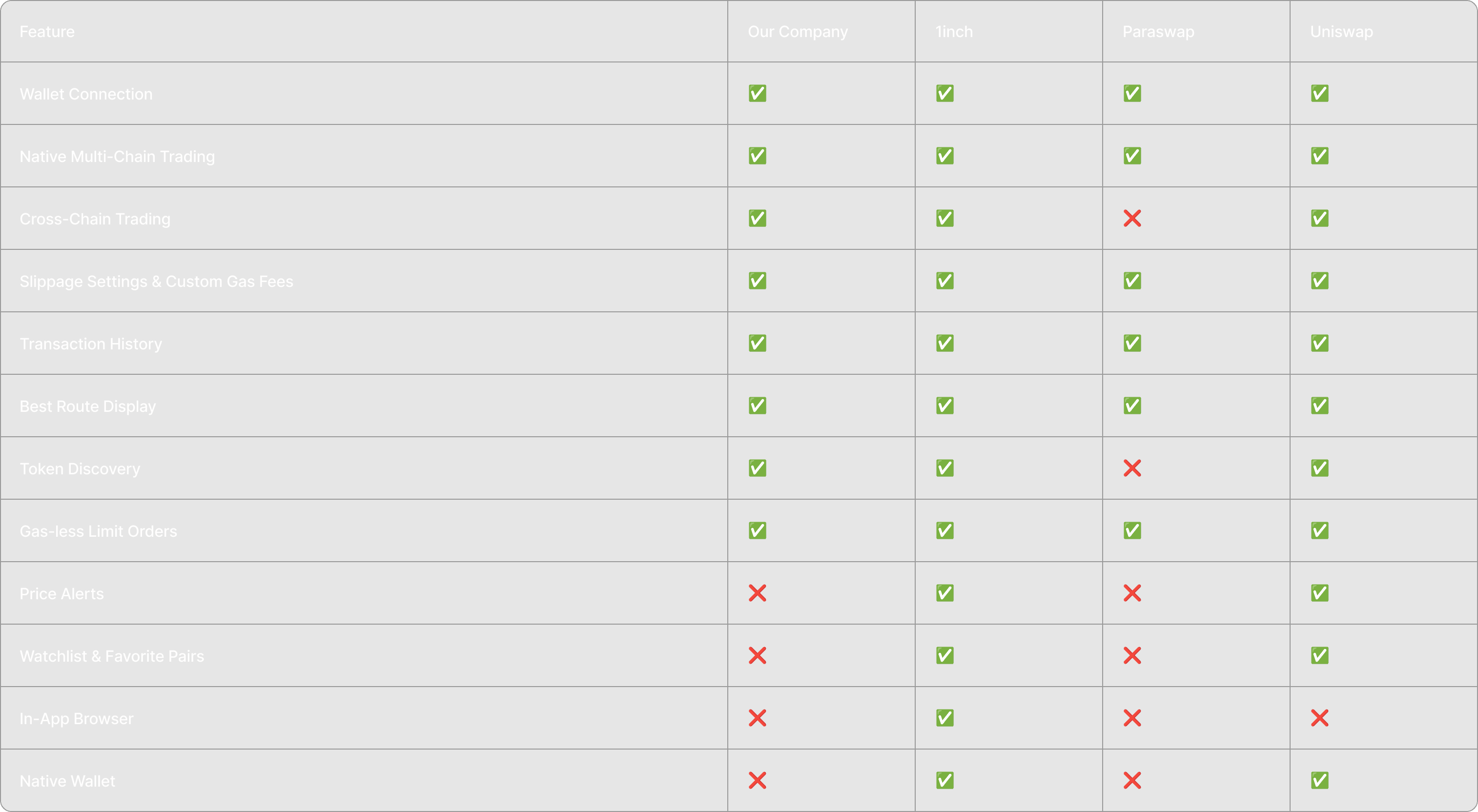
What We Could Make & Competitive Analysis
I measured what we could feasibly make based on what we have available on web. I also did a competitive analysis to understand what was crucial to implement in order to be competitive.
Where Should Our Efforts Be?
I prioritized where our efforts should be based on the impact that different features would have. I based this off data in the system. I knew that Native Multi Chain Trading made up 76% of our revenue. Some of the other features like "Best Route Display" were experiential features that I knew were important based on feedback from users.
Large Discussion With The Team
What We Should Ship
Wallet Connection
In order for this app to be functional, users need to be able to connect a wallet to Benefit from the DEX aggregation. We would not have a native wallet or Fiat on-ramp to start.
Single Chain Swapping
95% of swapping that occurs on web is single-chain swapping, meaning users swap coins within the same network/ blockchain generally. Only 5% is cross-chain swapping.
Trade History
Users need to be able to see that transactions have been completed to avoid them constantly leaving the app to check whether a transaction went through.
How Do Users Usually Swap Coins?
UXR showed that most users know which coin they are going to swap before arriving to our web product.
They either select popular tokens (based on volume), or paste contract addresses in the search, to make sure they are not scammed.
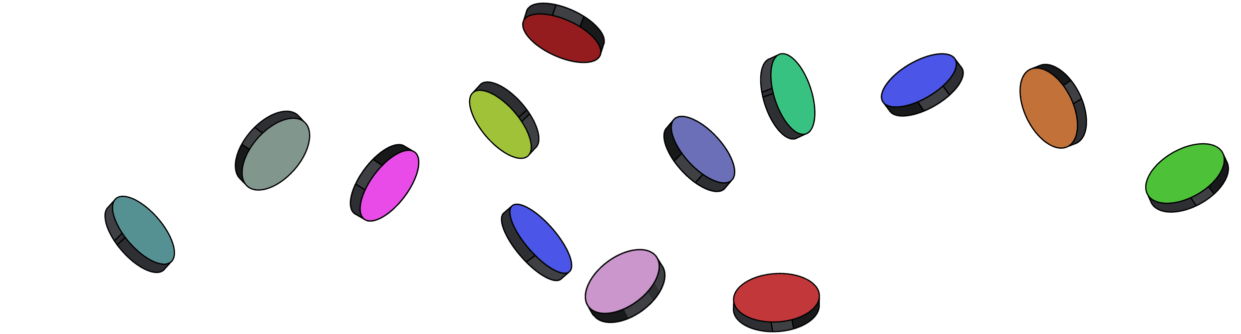
A Core User Journey to Swapping
The user journey can be visualized below, showing that most users do not need a discover page. They need search for obscure tokens and quick select buttons for common tokens
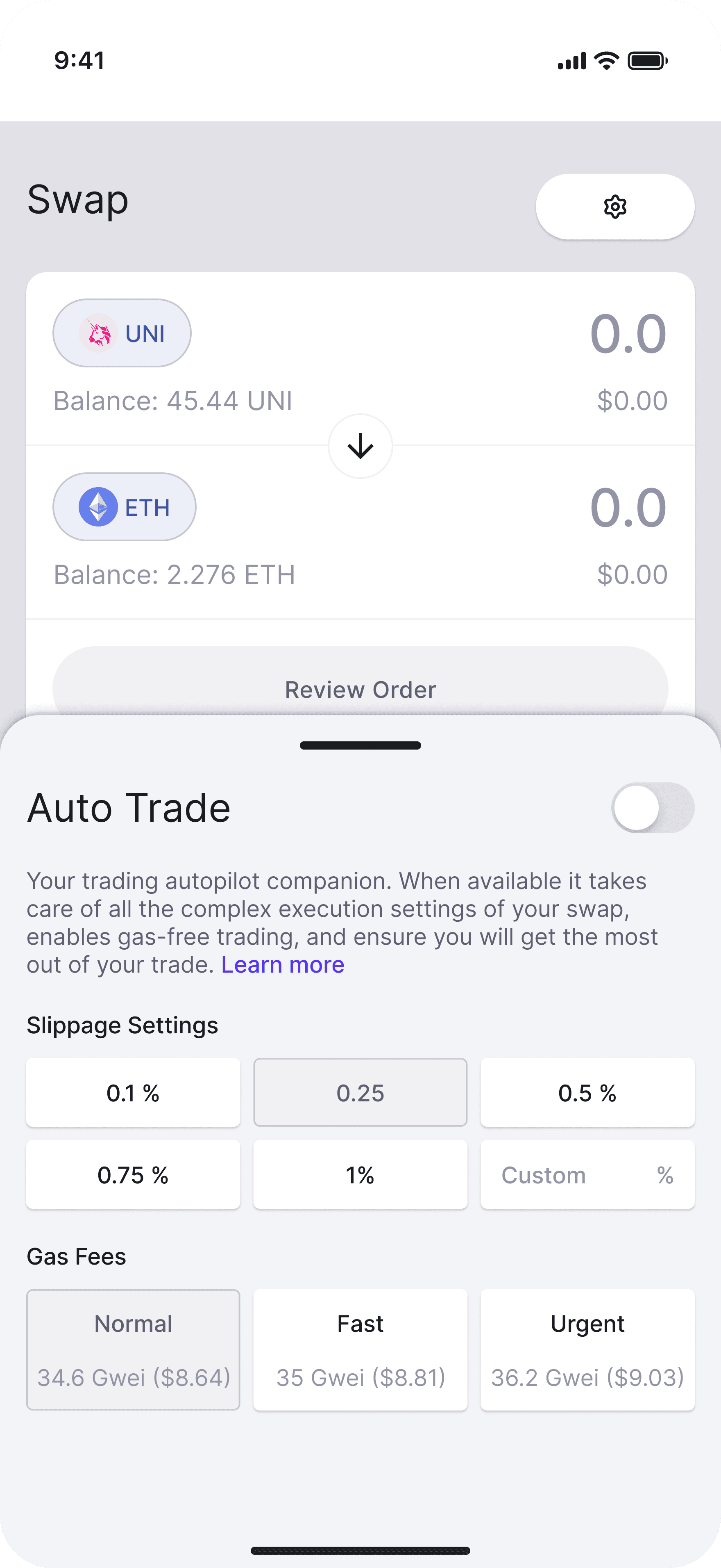
Wireframes - Swapping Options
I explored two layout options for swapping.
Option 1
Pros
47% of users on mobile apps use “MAX” to avoid math and friction.
Mental model- 68% of swap UIs in the top 10 wallets are horizontal.
Custom numeric pads - improve task completion time by up to 30%.
Cons
Less scalable layout for future iterations.
Accessibility concerns.
Option 2
Pros
Vertical task stacking improves speed of understanding by +34% in financial apps.
62% of advanced swap users want access to slippage, routing info, and gas impact before confirmation.
Reduces confusion for new users by 28% in swap comprehension tests.
Cons
Switching to the OS keyboard adds 1.2–1.7 seconds on average to task completion.
The First Hi-fi Screens
This was the first round of Hi-fi screens.
Turning Feedback Into Iterations
I got feedback from testing my first prototypes:
Didn’t feel like an app → Too much like web (dated design system).
Was overwhelming - users didn’t know what to press first. Too much information at once.
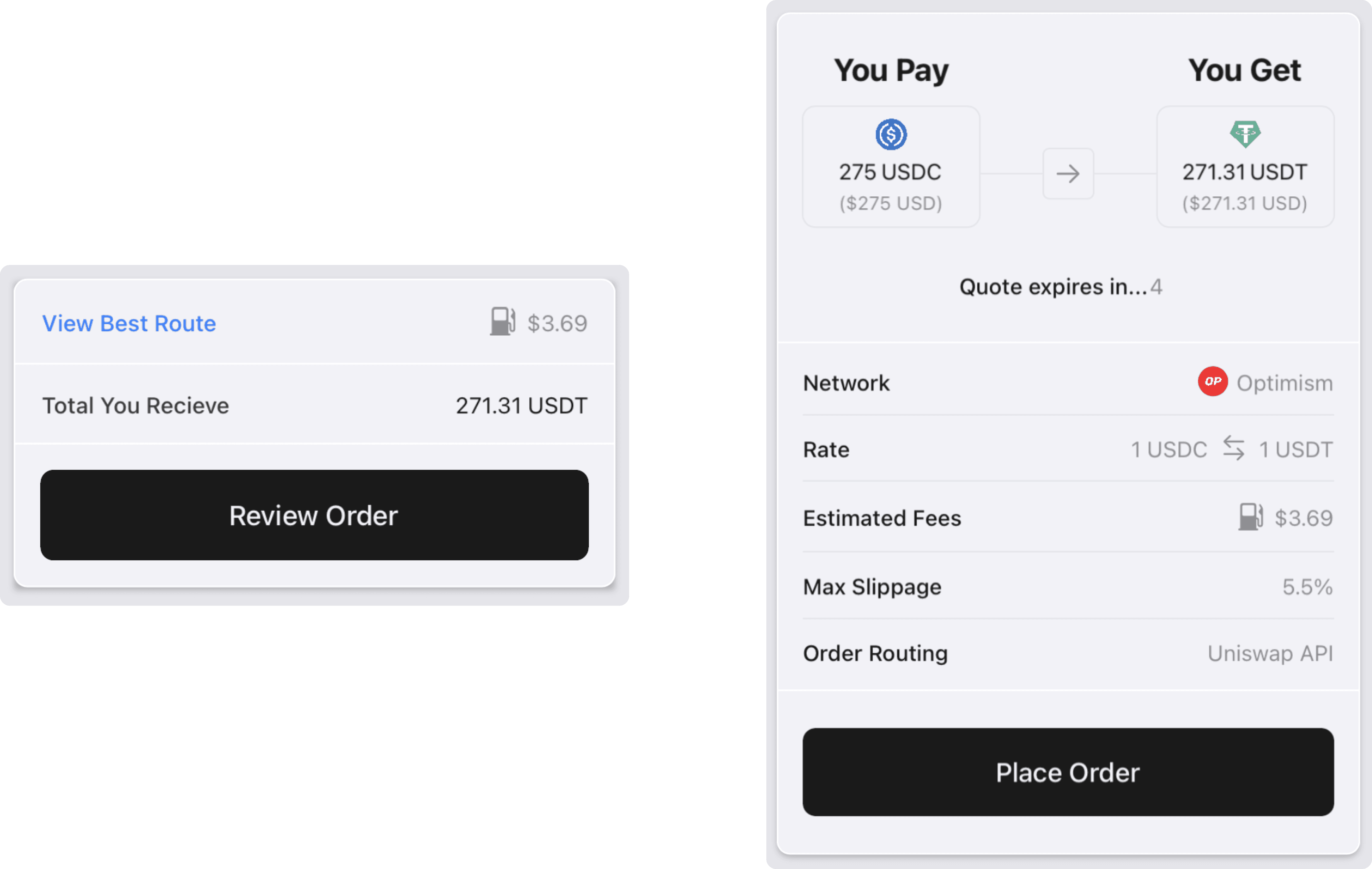
No “review order” screen made the app feel less safe - bad for user trust.
→ Asked to AB test review order screen on web. 25% of users abandoned swaps when no “review order” was present before confirmation.
I then created this prototype in a node based prototyping tool to address the feedback. I worked with the branding team to adapt the design system - updating the colour palette and the typescale.
Collaborating with Other Disciplines
Quality Of Craft
I designed this app in a node based prototyping tool. This included implementing:
Number & String variables.
Writing expressions in Formula Editor.
If & Else statements.
Generated Swift UI code for devs.
Leveraged Native animations where possible to speed up development.
Deployed app updates straight to Xcode for devs.
Learnings & Reflections
What would I do differently next time? I focused on the swapping flow, but I’d take a step back and consider how the UI could scale into a broader DeFi platform—staking, bridging, etc.
Single-chain vs. cross-chain UX tech
Designed for single-chain, but uncovered cross-chain UX complexity. Started future mapping for seamless, scalable flows.
Conversion funnels tell the story
Seeing 25% drop-off during swaps reinforced the need for visible real-time feedback to maintain user trust.
Results
We far outreached our goals.
63%
Migrated & retained web users